Should Heraldry Be Replaced by a Logo?
Something that we see regularly is an institution or a university wanting to discard the coat of arms that they have and substitute for it a logo. The usual reason given for this change is that a coat of arms is “a little old-fashioned,” that it has “an older look to it.” By this is generally meant that it’s “outdated” and not “contemporary,” and that they’d like to change it for something “more relevant” and “modern.” (Yes, those are all real quotes by different people talking about their organization’s coat of arms and why it ought to be changed.) As it often happens, these institutions will sometimes pay hundreds or even thousands of Euros (or pounds sterling, or US dollars) to a graphic design company to create a new “brand” which will boost their image as relevant to contemporary times.
Among the difficulties of taking this course of action, however, in addition to the (often excessive) cost, is that in just a few years, their “modern,” “contemporary” logo will itself be “outdated” and have to be replaced, again at high cost, by something even newer.
A coat of arms is not like a trademark
I have to wonder, though, if part of this issue lies in the fact that many people believe that a coat of arms is just like a trademark; that it absolutely, positively must be drawn exactly the same way every time it appears. It is true that this is the case with a logo or a trademark; the exact depiction, and even the shades of the colors used, must be the same every time.
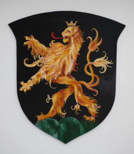
But this is not the case with heraldry, as just a little research can demonstrate. Different artists may draw differing interpretations of a coat of arms; they may use slightly different shades of the colors; they might even choose to display it on a shape other than a shield; and they could certainly draw it in different artistic styles, whether traditional, Baroque, Art Deco, modern, or any other style. None of those things changes the coat of arms itself; it only changes the way it may be perceived.
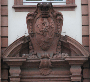
Coat of arms of Heidelberg, Germany
As one example of this, let us look at the coat of arms of the City of Heidelberg, Germany, which can be seen in various styles all around in the “Altstadt”, the Old City portion of Heidelberg.
You can find
Heidelberg’s coat of arms carved in stone
Painted into stained glass

Printed onto fabric

Cast in metal

Painted onto a wooden surface
Painted and fired onto a ceramic panel

Cast into the door handles of a public building

And even – my personal favorite –Carved in the round
without even being placed on a shield of any kind (Although on this last they do have the lion holding a scepter and orb, which do not appear in any of the other depictions.)

The different styles, from very traditional to Baroque to Art Deco, are easy to see. And this same coat of arms can easily be further “modernized” in the future to match changing tastes in art and design.
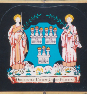
Coat of arms of Dublin
Another example of how a coat of arms may be “updated” to meet changing artistic needs can be seen in the depictions of its coat of arms in and around City of Dublin, Ireland. The arms consist of a blue shield with three white castles whose towers are topped with flames. Walking about the central part of the city, these arms can be seen in a very traditional fashion
on a bicycle rack
On the side of a public building
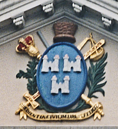
In traditional fashion
on many of the city’s street lamps, both colored and monochrome

In a simplified version
on waste receptacles placed about the city

In a very modern logo style
on city-owned services sites and vehicles (again, both colored in blue and white or monochromatic in black and white)

and finally
In an extremely stylized fashion cast
in metal access covers on the sidewalk.

Each version, traditional and modernized, is the same coat of arms that the city of Dublin has used for centuries. (The arms were officially granted in 1607, but elements of it appear in the city’s seal as early as the 13th Century.) Notice also that these different depictions are often placed on entirely different shapes of display, from traditional shield shapes and ovals to horizontal rectangles with semi-circular “bites” taken out of the corners.
There is no need to pay some graphic design firm hundreds or even thousands of Euros/pounds/dollars for a new logo that is “contemporary” and “updated.” Simply redraw the arms that already exist into a more modern style, and there you have the “new” brand, which is really just a new version of the “outdated” and “old-fashioned” brand!